-
Nutrivend selects Forterro’s Orderwise to support online expansion and streamline operations - April 11, 2025
-
ARROWXL LAUNCHES AMBITIOUS ZERO WASTE ROADMAP - April 8, 2025
-
THE BCMPA’S NEW CAMPAIGN DRIVES OUTSOURCING SUCCESS IN Q1 - April 7, 2025
-
BLACKOUT TECHNOLOGIES TARGETS TELEMATICS-INTEGRATED MOBILE DEVICE BLOCKING TO COMBAT SMARTPHONE DISTRACTION - April 1, 2025
-
Sparck Technologies awarded Royal designation - March 27, 2025
-
OpenADR Alliance announces first OpenADR 3.0 certified products with EVoke Systems, E.ON Energy and Universal Devices - March 25, 2025
-
Growing fulfilment and contract packer appoints new Managing Director - March 25, 2025
-
When is it time to invest in a WMS? Understanding the key trigger points - March 25, 2025
-
eCapital helps Vantage Recruitment on its journey to financial success - March 24, 2025
-
Hugo Beck Celebrates 70 Years of Packaging Innovation with Open House Events - March 20, 2025
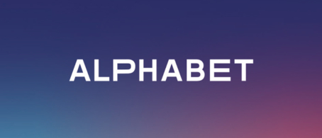
Today, Alphabet announces an extensive brand refresh to reflect the new strategic focus of the company. With a redesigned logo and corporate identity, Alphabet is moving into a new era of mobility.
Alphabet, a leading provider of future mobility since 1997, is marking an important milestone with the launch of its new image and brand focus. “Alphabet is a forward-thinking company. Spotting and anticipating trends, implementing new mobility and technology, and our overall flexibility to change, is a core part of who we are. Now is the time for us to adopt a brand appearance to reflect the upcoming changes in our sector,” says Markus Deusing, CCO of Alphabet International.
One major point is the company’s strengthened commitment to sustainability. “Sustainability is the leading topic of the future – in all areas – and we want to play a vital part in shaping this future,” says Deusing. “This summer, the EU finally announced Europe’s goal to become the first continent to be climate neutral by 2050. This clearly increases the need for action on the part of our customers, but also for us as a mobility provider. Company cars are not only driven more than twice as often as private vehicles on average, but they also account for over 60 percent of all new cars sold in Europe. Given this background, the electrification and thus the decarbonisation of fleets is of particular importance for achieving climate targets. It will be more important than ever to not only make full use of our strong expertise in consulting, but also to continuously develop even more convenient and flexible services with creativity and excellence. This, along with the trusted partnership we have with our customers and their drivers, sets us apart from the competition.”
Alphabet plans to promote sustainability through the extension of its existing range of eMobility and new mobility options via AlphaElectric. With the implementation of its sustainable consulting, Alphabet will offer expert guidance on CO2 targets, CO2 neutrality and further sustainability topics to its customers.
Another catalyst for the coming changes is the topic of digitalisation. The future of fleets will be determined by flexible, digital solutions that make customers’ lives easier and more convenient. An example of this is the AlphaGuide app, which combines simple self-service with connectivity, to make mobility as convenient as possible for both decision makers and users. The new brand identity reflects this deep-rooted understanding of service and customers, and translates Alphabet’s new direction into a new brand promise : “Your mobility. Made easy.”
Starting with the new, straightforward logo, Alphabet’s design and market presence becomes sharper, more emotional, and modern. To create this look, key design elements of the former appearance have been reinterpreted and new facets added to make the brand more digital and vibrant. “The new design is as agile and modern as we are. But it’s much more than just aesthetics; it reflects the changes within the company,” Deusing explains. The refreshed brand is expressed through a sleek design with an updated Alphabet logo as well as a new colour palette – a deep blue, a warm coral and a fresh light blue to create a modern and contemporary brand impression. Along with a new typeface, the Alphabet brand is now optimised for the digital world to communicate and interact with its customers and other stakeholders in 31 markets.
This brand refresh underlines Alphabet’s new position and company values; Responsibility, Expertise and Partnership. These were chosen to modernise Alphabet and reinforce its human focus while building the new brand foundation. “We are always actively driving change for our customers and ourselves. There is an exciting journey ahead of us,” Deusing concludes.


